Home
Watch
IBC2026
IBC Daily
Log in
Enter keywords
Submit search
Watch
IBC2026
IBC Daily
Accelerating Innovation
Accelerating Innovation
IBC Accelerators
Tech Papers Hub
Intellectual property
Artificial Intelligence
Artificial Intelligence
AI Audio
AI Post-Production
Deep Fakes & Digital Replicas
Ethics
GenAI
Machine Learning
Scraping & Training
Connective Tech
Connective Tech
5G
6G
Cloud
Digital Audio Workstation
Edge Computing
IP Workflows
Network Slicing
IBC Show
IBC Show
IBC2024
IBC2023
IBC2025
Immersive Tech
Immersive Tech
AR
Immersive Audio
Metaverse
MR
Spatial Computing
Volumetric Video
VR
XR
OTT & Streaming
OTT & Streaming
AVOD
CDNs
FAST
SVOD
TVOD
People & Purpose
People & Purpose
Acquisition & Retention
Diversity, equity & inclusion
Skills & Training
Sustainability
Production
Production
Audio Tech
Camera Tech
Content Acquisition
IP Production
LED Volumes
Live Production
Outside Broadcast (OB)
Remote Production
Sports Production
Storytelling
Studio Production
Virtual Production
Virtual Production
Camera Tracking
Worldbuilding
Motion Capture & Performance
Rendering & Compositing
Robotic Cameras
Enter keywords
Submit search
Post-Production
Topics:
Digital Intermediate
Editing Software
Graphics & Branding
Neural Radiance Fields (NeRFs)
VFX
Choose a topic
Digital Intermediate
Editing Software
Graphics & Branding
Neural Radiance Fields (NeRFs)
VFX
View other themes:
CHOOSE THEME
ACCELERATING INNOVATION
ARTIFICIAL INTELLIGENCE
CONNECTIVE TECH
IBC SHOW
IMMERSIVE TECH
OTT & STREAMING
PEOPLE & PURPOSE
PRODUCTION
VIRTUAL PRODUCTION
Features
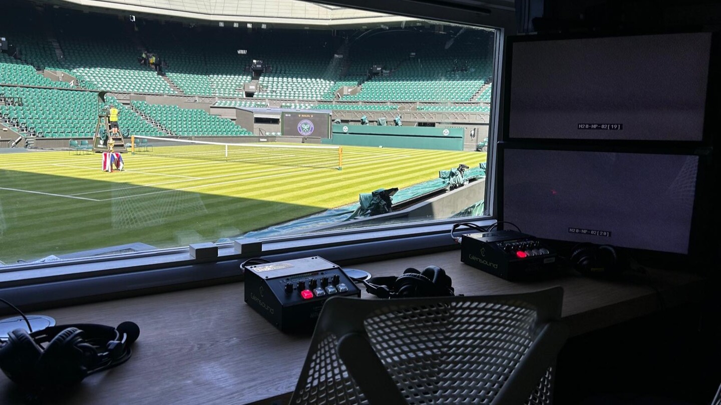
Wimbledon 2026: ESPN gears up for record breaking year
Read now
News
Adobe to acquire AI firm Topaz Labs
News
Camden Film Quarter receives planning approval
Features
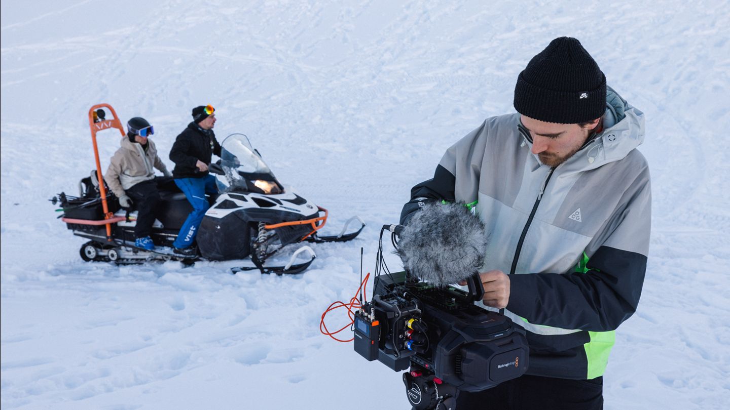
KICK: Writing the rules of high-altitude immersive production
Features
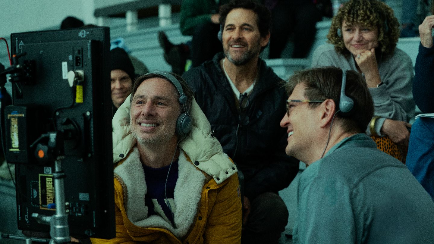
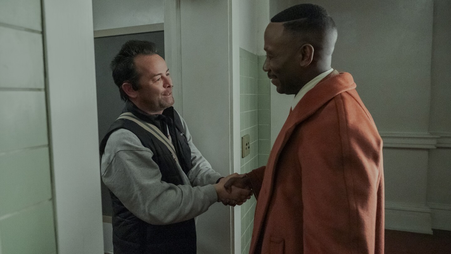
Behind the scenes: Spider-Noir
Features
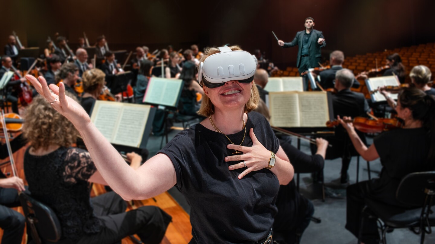
From screens to spaces: The rise of immersive experiences in live events
Features
Creator takeover at MPTS: “You’re competing for tiny slices of attention”
News
Hybrid AI VFX creative studio The Next Valley launches
Features
Behind the scenes: Eurovision Song Contest 2026
News
Film and TV Charity launches 2026 Looking Glass Survey
News
Framestore promotes Theo Jones to Creative Director of AI
Interview
Mathieu Kassovitz tells filmmakers: “Adapt or die”
News
UK screen industry must invest more in mid-level professionals, ScreenSkills reports
Features
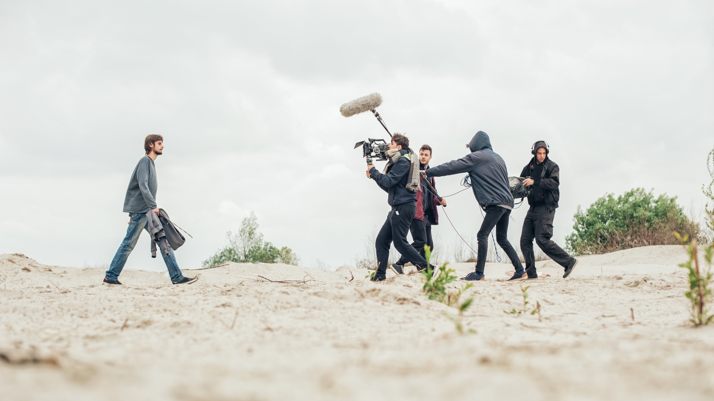
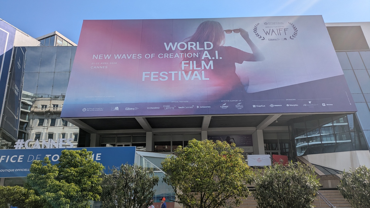
World AI Film Festival: “There is no emotion in AI”
News
Luma, Wonder Project, and AWS launch AI production services company
Features
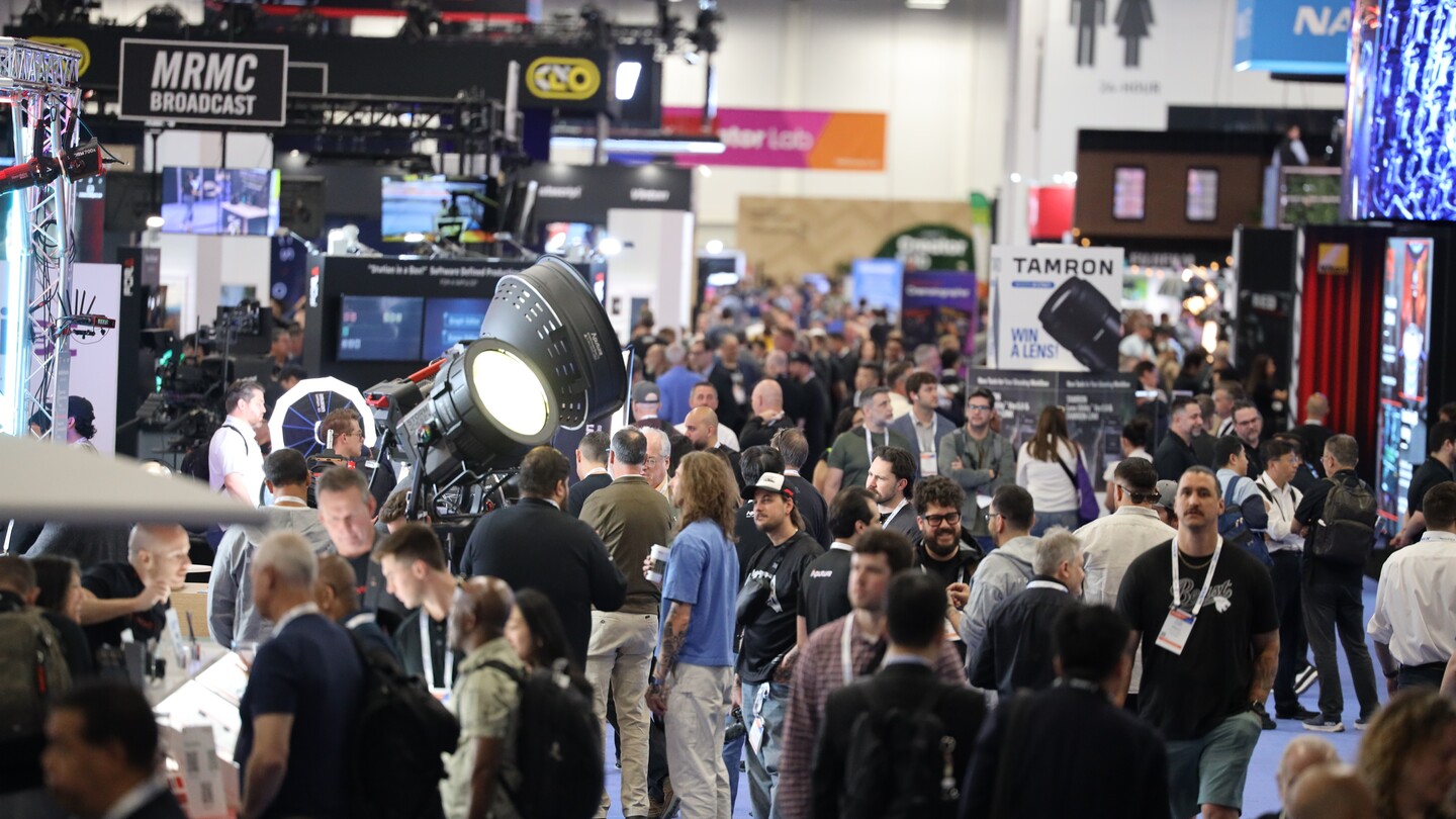
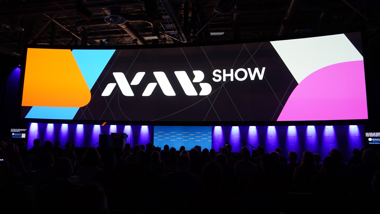
NAB 2026 technology round-up: “The biggest shifts in media are no longer theoretical”
Features
NAB 2026 review: “Live immersive production is here, and it’s extraordinary”
Features
Behind the scenes: Rooster
More

.jpg)