Home
Watch
IBC2026
IBC Daily
Log in
Enter keywords
Submit search
Watch
IBC2026
IBC Daily
Accelerating Innovation
Accelerating Innovation
IBC Accelerators
Tech Papers Hub
Intellectual property
Artificial Intelligence
Artificial Intelligence
AI Audio
AI Post-Production
Deep Fakes & Digital Replicas
Ethics
GenAI
Machine Learning
Scraping & Training
Connective Tech
Connective Tech
5G
6G
Cloud
Digital Audio Workstation
Edge Computing
IP Workflows
Network Slicing
IBC Show
IBC Show
IBC2024
IBC2023
IBC2025
Immersive Tech
Immersive Tech
AR
Immersive Audio
Metaverse
MR
Spatial Computing
Volumetric Video
VR
XR
OTT & Streaming
OTT & Streaming
AVOD
CDNs
FAST
SVOD
TVOD
People & Purpose
People & Purpose
Acquisition & Retention
Diversity, equity & inclusion
Skills & Training
Sustainability
Production
Production
Audio Tech
Camera Tech
Content Acquisition
IP Production
LED Volumes
Live Production
Outside Broadcast (OB)
Remote Production
Sports Production
Storytelling
Studio Production
Virtual Production
Virtual Production
Camera Tracking
Worldbuilding
Motion Capture & Performance
Rendering & Compositing
Robotic Cameras
Enter keywords
Submit search
Displays & Screens
Cinema
Topics:
4K/UHD
8K
Cinema
HDR
HFR
SDR
Screen Tech
LED screens
Choose a topic
4K/UHD
8K
Cinema
HDR
HFR
SDR
Screen Tech
LED screens
View other themes:
CHOOSE THEME
ACCELERATING INNOVATION
ARTIFICIAL INTELLIGENCE
CONNECTIVE TECH
IBC SHOW
IMMERSIVE TECH
OTT & STREAMING
PEOPLE & PURPOSE
PRODUCTION
VIRTUAL PRODUCTION
News
Camden Film Quarter receives planning approval
Read now
News
SMPTE opens up standards catalogue for free
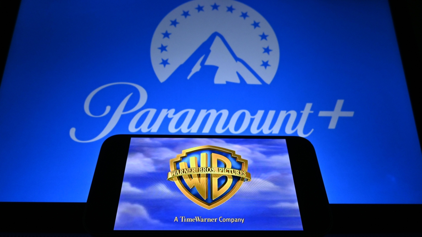
News
US Department of Justice approves Paramount’s acquisition of Warner Bros. Discovery
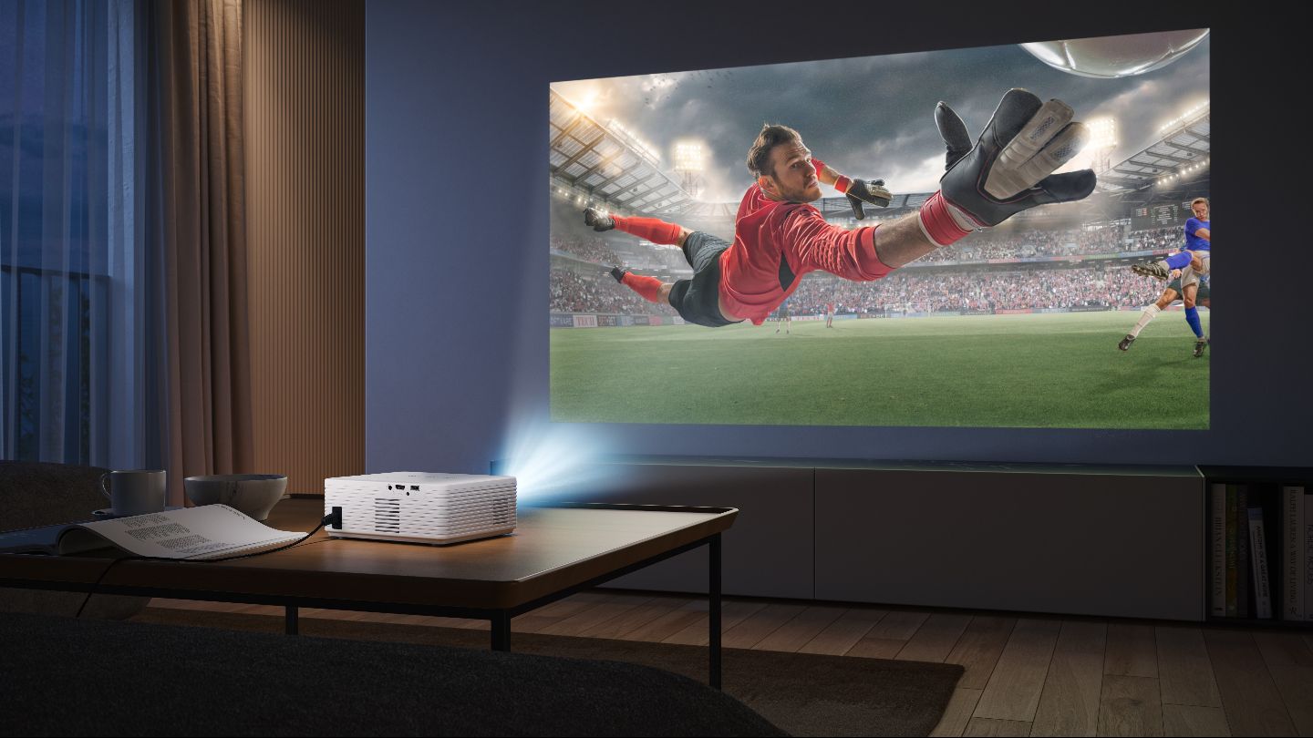
News
Roku launches smart projectors to corner UK market
Features
Behind the scenes: Eurovision Song Contest 2026
News
Bectu calls for government intervention in Paramount–WBD merger
Interview
Mathieu Kassovitz tells filmmakers: “Adapt or die”
News
Netflix readies wide theatrical release for Greta Gerwig’s Narnia
Features
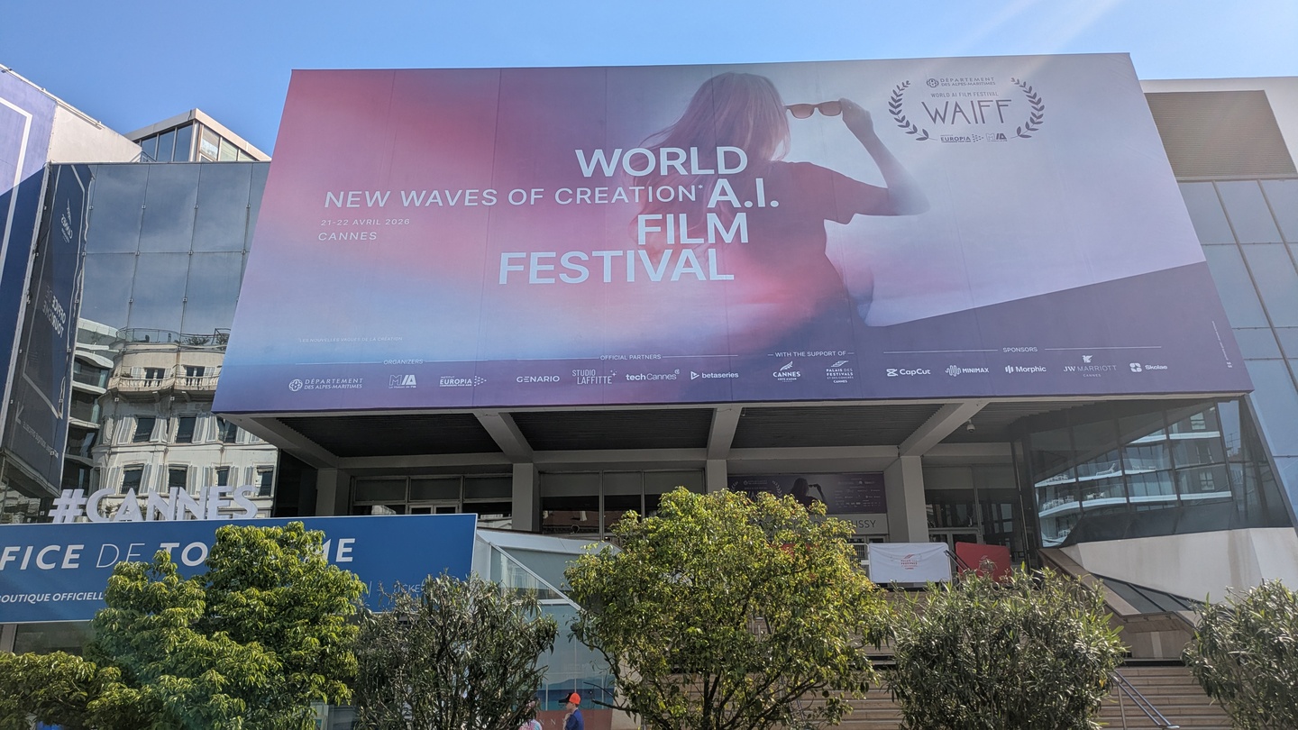
World AI Film Festival: “There is no emotion in AI”
Features
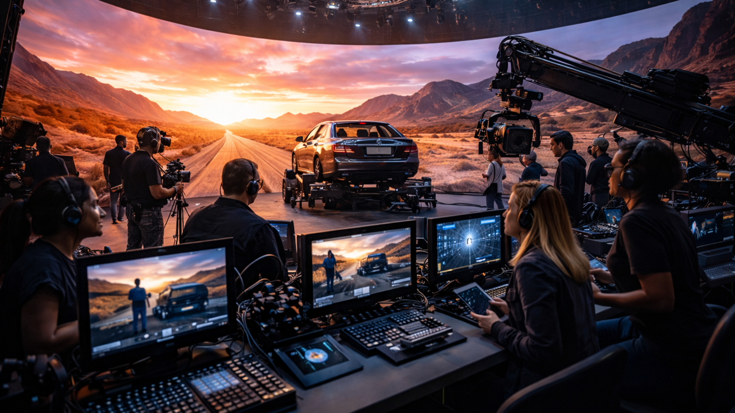
Virtual production after the hype: Where it actually works now
Features
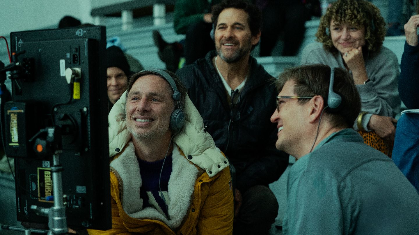
Behind the scenes: Rooster
Features
Building Bedlam: “Can I shoot an entire feature film on 65mm?”
News
One Battle After Another wins six Oscars
Tutorials
What is the current tech behind cinema screens and projection?
News
BSC Expo: “AI is a real b*****d to work with”
News
UK film and high-end TV production hits £6.8bn in 2025
News
Paramount CEO David Ellison pens open letter to UK creative sector
Tutorials
Production – Tutorial, Ep 3: Grading and mastering for cinema display technologies
More


.jpg)


.jpg)